Rossi Election Website
Background
This project involved creating a responsive website for a school board campaign in the South Bay for the 2016 election. The main problem to solve was how to create a captivating and informational website that would inspire potential voters to cast their vote for Rosemary Rossi, the current school board vice president incumbent.
Research
Before speaking with stakeholders, I went through the websites of current local school board members and those running for school board for the first time in Bay Area to understand the current state of these types of websites.
Competitive Analysis
I researched over 15 school board campaign sites in the Bay Area to understand key topics and trends.
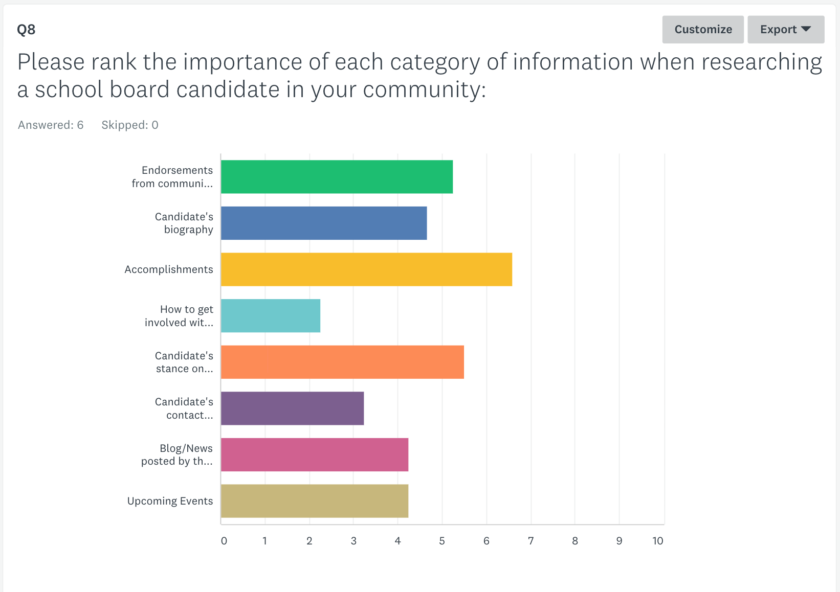
Using an online survey, we reached out to several demographics in the local area to find out what they were looking for in school board candidates. We also wanted to understand how they researched candidates to gain insight into how people would be finding the website.
Survey to Constituents
I sent out a 10 question survey to Rossi's target audience using Survey Monkey to find out general election related information.
Design
After synthesizing the research and reviewing the findings with the stakeholders I designed the information architecture for the skeleton layout of the website. The main design is centered on a two-level hierarchical navigation, which will be easy to read and understand for first-time visitors to the website.
Drawing upon my work with Nike, I knew that the design should incorporate an easy to read side navigation on desktop and drop down navigation on mobile. The site had to be responsive, have easy to digest information, and visually appealing.
Information Architecture
Some examples of the design before putting the website into production.
Result
Rosemary Rossi had the most sophisticated digital presence in her race and the only one with a completely responsive website. She ended up winning the election in a landslide.
PRoduction Website
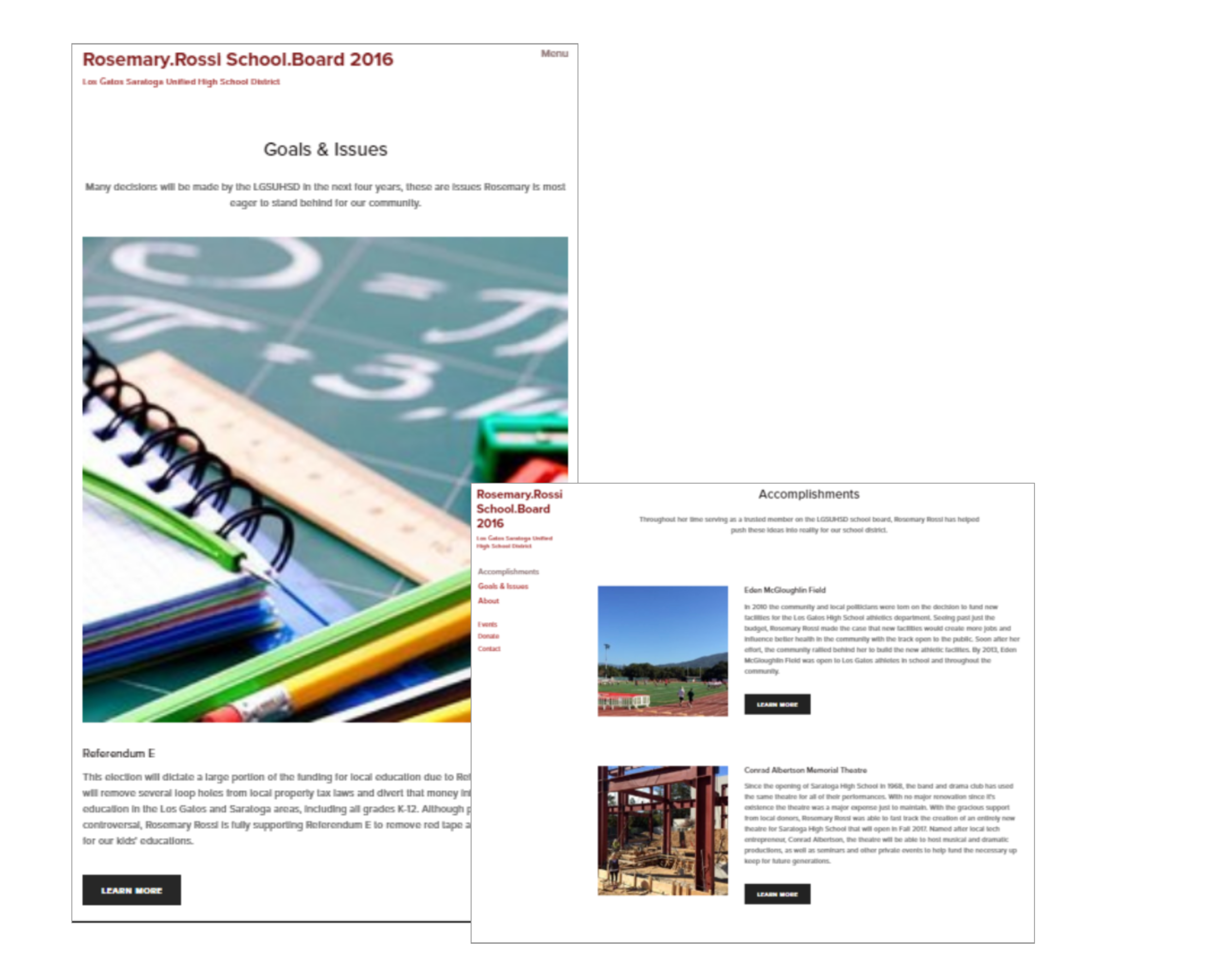
Screenshots of the mobile first, responsive website in production.


